Originally presented at VN;Conf 2023.
Hello everyone, my name is Ingrid and today I will be talking to you about Art Direction and Execution for Visual Novels: Taking your vision into the visuals of your visual novel.
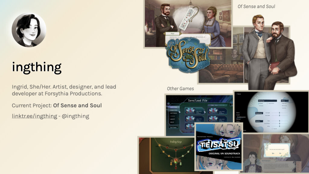
So for a bit about me: I’m the artist, designer, and lead developer at Forsythia
Productions and currently we are producing Of Sense and Soul, a queer
Victorian visual novel. I also do freelance work for other games doing GUI design as well as logo and branding.
What composes the art direction of a visual novel?
Now, the most important question when considering how to go about creating the art direction of your game is what makes it up.
“Art direction combines art and design to evoke a cultural and emotional reaction.”
“Art direction is about evoking the right emotion, it’s about creating that connection to what you’re seeing and experiencing.”
Daniel Mall, Art Direction and Design, A List Apart Issue No.317
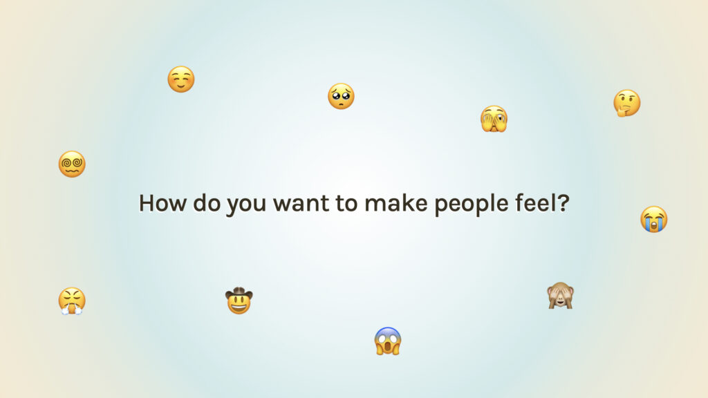
Daniel [Mall] says that “Art Direction combines art and design to evoke cultural and emotional reaction.” He also says that “Art direction is about evoking the right emotion. It’s about creating that connection to what you’re seeing and experiencing…” and that really gets to the crux of what an art direction does. It asks:
How do you want to make people feel?
When we’re thinking about emotions when connected to experience there’s an example I want to show you to help you understand that connection: theme park rides.
When you walk into a theme park and you see rides for example these two: the Hair Raiser and It’s a Small World. The impression you get from them is incredibly different. The Hair Raiser looks like a scary roller coaster because of, you know, the giant scary clown, the bright colours, the giant roller coaster track. And then you have It’s a Small World, which is a very whimsical, delightful castle facade—but you don’t actually see what’s inside.
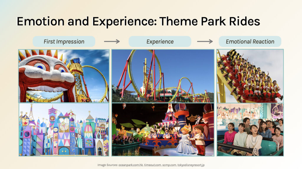
These directly translate to the experience you’ll have in those rides:
with the Hair Raiser you see the track, you see exactly how
many loops you’re doing, you see exactly how high you’re going to be going, and to top that all off, you’ll see how fast the ride’s going and you’ll hear the people screaming.
But with It’s a Small World, you don’t really get much of that feedback. You go into the ride and there’s this scenic journey around the whimsical puppet world that is actually reflected by the exterior of the ride, and these [exteriors] are quite carefully crafted to elicit the right emotional reaction.
The Hair Raiser is very in your face; it it shows you exactly what you’re getting, which is thrill, acceleration, fear, lots of adrenaline. And with It’s a Small World you go in and you have a delightful time: exactly what it shows on the package.
So, thinking about that creative intent is important.
When looking at your vision, the main thing is, you need to know what your story and your game is about: so what is [your story] about?
- Is there a message or conclusion you’re trying to convey?
- What are the key themes of your game?
- How will making the story into a visual novel, which is quite a unique medium, help tell it?
Once you have those questions mostly answered you can think about how the emotions work with your game. I would recommend, at this point,
writing down the emotions you want players to feel.
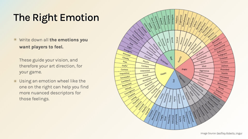
On the right here I have a emotions wheel that goes from these central core emotions into much more nuanced ones. It branches out, and you can see that the nuances are pretty much endless and very varied.
These will guide your vision and your art direction for your game.
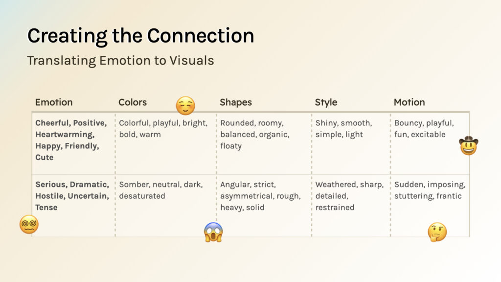
Now, it can be hard to translate that in motion, into the visuals for your game—so looking at these two examples of emotions, one set is very positive: cheerful, heartwarming, happy, friendly, cute—whereas the other is much more dark and more negative: serious, dramatic, hostile, uncertain.
There are many different visual elements you can actually use to manipulate those emotions. If you want a more positive-feeling color you might go for something bright and warm, whereas if you want something that’s more serious you might go for darker colors and make them more desaturated. And you might go rounded versus angular, smooth versus weathered, bouncy versus imposing. That’s how you can manipulate the visual elements in your game to suit the emotions.
Visual Elements
So what are the visuals you can put in your game? Well, visuals, I would say, serve both to tell your story as well as facilitate the player experience and there are three categories I would put them under for the purpose of visual novel development:
- Story relevant visuals are ones that illustrate the story and its elements (think of things like sprites and backgrounds)
- In-game visuals are ones that facilitate the gameplay experience but don’t necessarily tell the story (so GUI elements)
- Branding/identity visuals which represent the game publicly, it’s sort of the first thing that a player sees when it when they interface with your game.

Story relevant graphics for example would encompass Sprites, CGs, and Backgrounds as well as others. Graphics in-game with encompass any text and UI graphics you have, and Branding and Identity would be any logos, promotional graphics you have, as well as store page graphics.
You might notice that I have motion and cinematography at the very bottom across both story relevant and in-game and that’s because using that tool of the viewer’s perspective can change a lot.
Perspective & Motion

For instance if you want the player to empathise more with the main characters you might want to use a first person view and have them literally see through the eyes of the main character; or if you want them to be more of an observer you can pull out the camera and make them an external viewer, and have the characters all be on scene without the player involved in it. You can also change the amount of movement you have in scenes and with the camera by making the camera move more or less, creating a feeling of stability versus a feeling of liveliness.
The proximity of the player to the scene is also important: if you’re closer to the scene you will feel a little bit more intimacy whereas if you’re further from the scene you’ll be more distanced, and that can change the emotions a lot.
You can also change the speed at which transitions and camera movements take place: if you do slower movements versus fast movements it can create different emphasis for different emotional beats.
I would actually recommend you take a look at Vimi’s VN;Conf 2022 talk and his video on levelling up your sprites to sort of understand how important the cinematography can be in a visual novel
From Vision to Visuals: Case Studies
In order to better understand how that vision can be translated into visuals, I’ll be walking you through two case studies: one is Of Sense and Soul which is my game, and Parasite in Love which I was on the team for during Spooktober 2022.
Of Sense and Soul
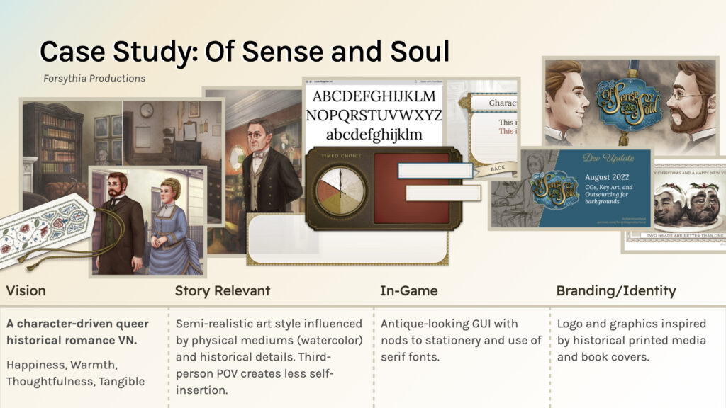
With Of Sense and Soul, it’s a character-driven queer historical romance visual novel and I want it to be very happy and warm and and make the players think about the characters so for the story relevant visuals I went with a semi-realistic art style influenced by physical mediums of art like watercolour and used a lot of historical details to kind of cement the realism of the setting.
I use the third person point of view to create less self-insertion of the player because the focus really was just the character drivenness of the plot and the characters within the plot. The in-game graphics use an antique looking kind of feel and the UI uses not stationary and serif fonts to really bring out the sort of antique Victorian vibes. For the branding and identity the logo and graphics are inspired by historical print media and book covers and I carried over a lot of the art from the game itself as well as key visuals to really cements the character-driveness of the story and make sure that’s presented to the world.

For the cinematography Of Sense and Soul there’s a lot of atmospheric and emotion-led cinematography. You can see here that we follow the the character a lot and the emotions that the character is feeling are what sort of the guide the camera movements; you can see that dramatic dutch angle and different pans up and down, and different close and far shots of the characters create a lot of different emotional emphasis.
Parasite in Love
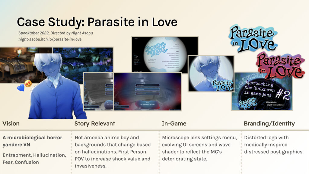
With Parasite in Love, which is very different, it is a microbiological horror yandere VN and it’s meant to make players feel trapped and a bit fearful and confused and kind of make them question a little bit of their sense of reality
So for the story relevant graphics (this was not headed by me, NiAsobu and Baguetti handled the art)… There was a hot amoeba Anime boy for the yandere themes and backgrounds that change based on hallucinations. You can see in the background there there’s the regular view of a bed and then there’s the kind of corrupted view of the bed.
The game uses first person point of view to increase the shock value and invasiveness of the narrative for the in-game graphics, so the UI (which I was responsible for) used a microscope lens settings menu to further the kind of microbiology/medical theme of the game and the UI itself actually changed and morphed to reflect the main character’s deteriorating State later on. Ooyu, our programmer, actually added a wave shader to the UI and the screens overall to create more even more of that distortion.
The Branding and identity had to reflect everything inside the game so I again used a bit of a distorted effect on the logo and kind of took cues from that organic feel of, you know, microorganisms. I used a quite a distressed post graphic style in order to convey the horror element of the game.

As for cinematography, the game uses a lot of point of view shots; so you can see there the MC is crouching and standing back up. Here the parasite is getting up in the main character’s face, and this is actually also carried over into the title screen and the UI with the warping and rotation on the title screen as well as the undulation of the text box here. This is the box that’s seen at the very end of the game, which is when the main character’s state is at its worst.

Now to summarise what looking at those two case studies is meant to demonstrate: applying your Art Direction means thinking about the full presentation and intent of your game along with the purpose and implementation of your visuals.
Visual Novels at the heart of it don’t necessarily have the most different visuals across visual novels—there are sprites, there are CGs, there are backgrounds—but how you display them and how you manipulate them will definitely change the emotions elicited from them.
if you want some more technical and marketing advice on how to develop a game’s art style specifically I’d recommend you take a look at Penta’s talk later today, which is titled More Than a Pretty Face: Art Direction for Visual Novels.
Executing Your Art Direction
Now in terms of executing your Art Direction, I’ve got a couple of tips for how you can start to think about it and begin to strategise, rather than sort of just do things, so:
Think like a Jammer
When I say “Think like a Jammer” I mean applying a game jam mentality to producing your visuals. Looking at what you’re trying to achieve in your art direction or story goals or a certain scope that you have, what strengths of yours will get you there, what constraints you’ll be facing, and how you can actually use the strengths and constraints to achieve your vision.
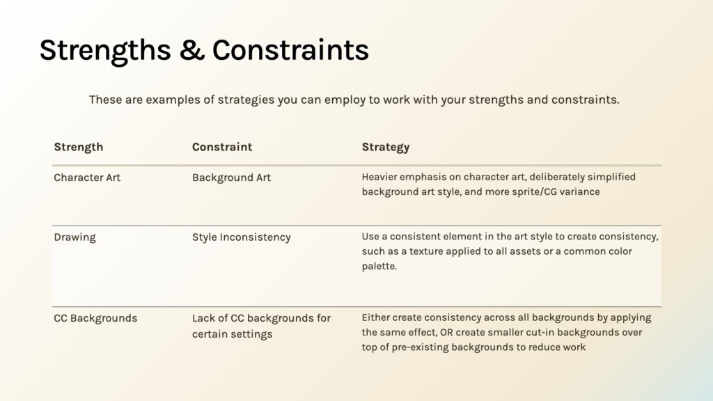
Here’s a table showing some examples of how you can strategise around different strengths and constraints:
If you’re very strong with character art but aren’t so good with background art you may want to have heavier emphasis on character art and maybe more variants on the Sprites while deliberately simplifying the background art style so that you put the emphasis on the characters and less on the backgrounds.
If your strength is drawing but your constraint is that your style can fluctuate, you can use consistent elements to create consistency, like textures that you apply across all assets or a common color palette.
If you have a lot of backgrounds at your disposal that are Creative Commons backgrounds but you don’t have certain backgrounds for different settings, you can create consistency across the backgrounds by applying the same effects or you can create smaller cut-in backgrounds over the top of pre-existing backgrounds to, number one, have a little bit of a break from the main art style and to reduce the workload of whoever is creating your visuals.
Planning Visuals
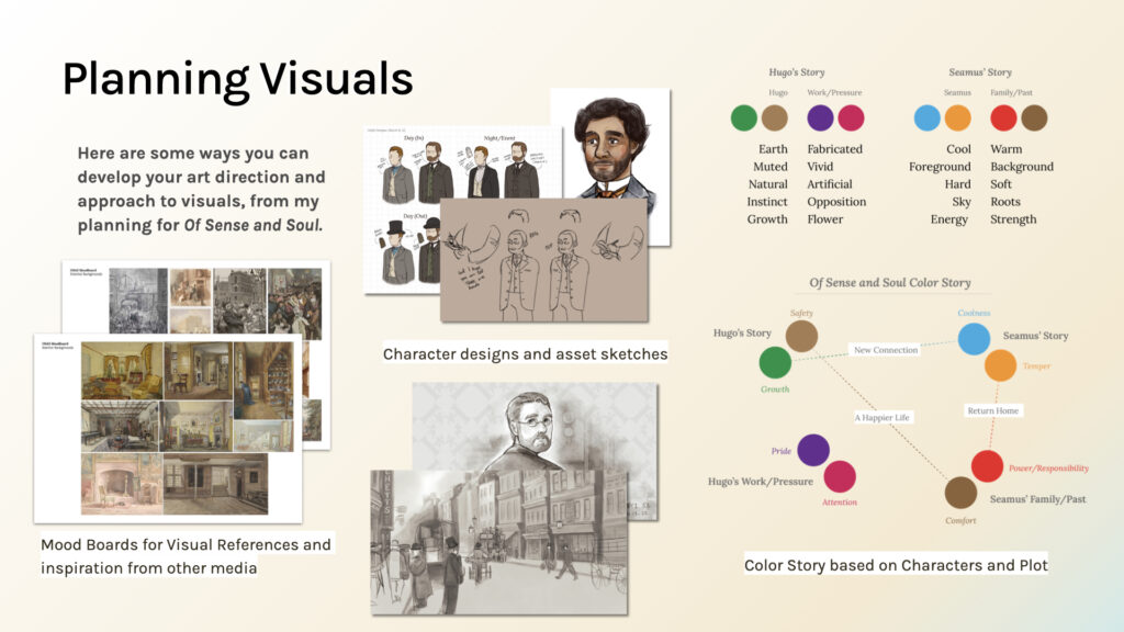
When taking a look at your Art Direction and translating that into your visuals, here are some things that I have done with Of Sense and Soul to help make the merge easier:
- I made mood boards especially for background art and settings to draw inspiration from other media and get a sense for what the game will look like.
- I designed and planned as assets, so I did character design sized style tests in game.
- I created diagrams and sketches of how Sprites would function.
Then, after I had that overview of what the game will look like, I went and created a colour story based on the characters and plot. For example Hugo’s story is much more of a contrast between earthy colours and brighter less organic colours for while Seamus’ is a bit more grounded and it’s about this contrast of the coolness and bringing it back into the warmer temperature of his story. So that’s something you can do to get at the colour scheme that you want to use and the words or descriptors you want to have applied to your visuals.
Realizing your Vision
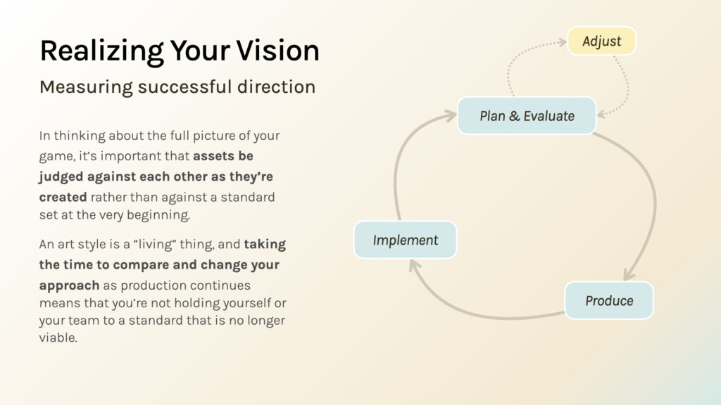
Once you have planned that out, I would actually advise when you’re realising the vision when you’re producing your visuals that when you measure the successful direction of your visuals you judge them against each other rather than judging them against whatever standard you set at the very beginning because I would for me personally as a creative I learn more and know what to do better when I do things and create constantly, so with each iteration I get better. But taking the time to compare and change your approach as production continues means that even if you had one idea of what things would look like at the start, you’re not holding yourself to some impossible standard or a standard that no longer really fits your vision during the process.
Tips for Making Assets (Stuff I learned the hard way)
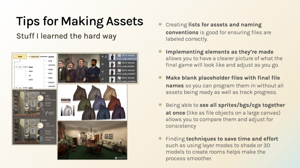
In lieu of planning and evaluating and adjusting as you go, I do have some tips for making assets that I did learn the hard way. I’ve re-made my assets quite a few times but for me I find firstmost that creating lists for assets and the naming conventions I’m using for different things is good for ensuring that my files are accounted for and that when I look at how many files I have left to do I know exactly what comes next because the naming convention is very clear.
I also like to implement elements as they’re made because it allows me to have a clearer picture of how it’ll look in game and it allows me to adjust as I go.
To do that I actually also make blank placeholder files with the final file names so I can actually program them in without every asset being ready this is especially important for me with Sprites because I may have the base Sprite ready before all the expressions, and having blank files next to the filled files or the file files is a very good visual checklist.
I also like to see all my assets together at once; on the left here you see some file objects of my Sprite files I’ve put together on a single canvas (this is a function that is also available in I believe Krita and Photoshop) and that allows me to compare them and adjust them for consistency. If someone’s height is off or the proportions on someone’s hands are off, I can change that in the main Sprite file while seeing the effects take place in the bigger comparison file
Finally, and this is probably the biggest tip, is finding techniques to save time and effort when you’re making your visuals is going to make a huge difference.
I use a multiply layer with my clothing shading; I use the same two colours multiplied over top of different base colours and I can shade very quickly because of it. I don’t have to colour match or pick colours every time I change the colour.
I also use 3D models to mock up the interiors for my backgrounds and I can get that idea down quicker than I would with a sketch.
These are some tips that you can take on in your practice if they suit you, they are things that have certainly helped me in making my vision for my game happen.
And that’s it! Thank you for attending my talk, and go forth and make people feel things!
Questions & Answers
Do you have any thoughts on Art Direction for marketing materials? There are certain tones, presentations and mediums that work better on social media than others. How do you combine your game’s unique art direction with those constraints?
So for marketing materials…I do work with the constraints of social media because there are certain sizes and ways that people display information on Twitter that are different from you know if you had a traditional print approach I usually make text that looks a little bit bigger and use more eye-catching visuals like the [christmas] puddings that people pointed out.
The Art Direction is mainly about looking at what is the kind of key focal point that will catch people’s attention, and then using that on social media because that’s what’s going to catch people’s attention when they are scrolling.
What kind of 3D modeling [do you use]?
The example I gave at the end here is actually from a program called Home Styler, and I can put the link [here] for you guys. It’s essentially an interior design tool but I also have also used SketchUp to mock-up backgrounds and it’s actually it’s faster than doing a sketch because you don’t have to figure out the perspective.
How did you write shaders in Ren’py for Parasite in Love?
I did not write the shaders in Ren’py for Parasite in Love, I believe that was a resource that Ooyu found. (See: Wattson’s Ren’py Wave Shader)
Let’s say you’re using CC assets for everything (somehow). Is it possible to still go about having something consistent with your direction then?
It is, and I mentioned in the constraints slide that you can apply the same texture or common colour palette in order to make everything feel consistent even if they are kind of cobbled together from different sources.
Any thoughts on the pros/cons of using dissonance between visuals and the typically associated emotions/etc. to convey stuff? (e.g., many anime horror games with cute art vs. horror games with scary art style)
I think that that is something that is down to the emotion you want to convey because that dissonance is going to cause confusion or disorientation for the viewer; I think that it is a smart way of eliciting an emotion.
When making camera and animation decisions do you do so after you have the assets and general blocking of sprites in game, or is this something you plan for as you actually write?
When making camera and animation decisions do you do so after you have the assets and general blocking of sprites in game, or is this something you plan for as you actually write?
With my game in particular I had not had experience with using camera movements yet, it was only when I had all my assets that I could actually get them in the engine and started moving things around.
For me it was not really planned, I didn’t storyboard it and I actually will have a devlog coming out about how I planned the camera to work and how I approached it coming sometime in the near future. (Read: Sprites, Camera, Action!: Visual Novel Cinematography in Of Sense and Soul)
Want to be notified when I make a new post?
Subscribe to the ingthing.dev newsletter for extremely spaced out email updates!